 If you have a camera capable of taking 3D photographs, and a Apple Computer, I have just found the simplest, quickest, easiest way to view your photos, It’s called ShowMe3D. Ever since I got my 3D camera I have been longing for a way to just unload my pics, and view them in 3D straight away, without having to jump through a million hoops, and this is it!
Open up App Store on your Mac and search for ShowMe3D, or click this link to Download ShowMe3D from the Mac App Store. It’s not free, but at just $4.99, it really is a bargain.
Once you have downloaded and installed ShowMe3D, open it up and you will see the main screen.
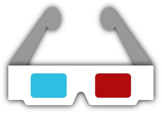
 Now, open the folder that contains the .mpo files (Multiple Picture Object) from your camera, and drag the pics you want to view onto the open window and put on your 3D glasses.
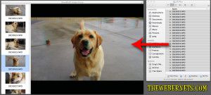 Instantly, you can view your 3D photos in 3D, and scroll through them in the same way you would using the “Preview” app. A feature of this program that I really like, is it also allows you to Export your .mpo files as Anaglyph Jpegs, so you can quickly and easily convert your .mpo’s to regular jpegs – cool huh!
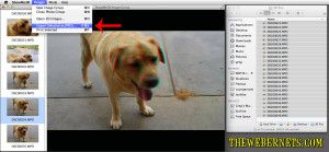 Here’s a Anaglyph 3D Jpeg I converted from an .mpo file using ShowMe3D – It’s my dog Benson.


