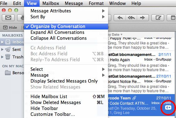
 Mac Mail has a feature now that groups emails with the same subject line together into a collapsed “forum thread” like manner, which saves space when you are looking at your inbox. The problem I find with it is that there just aren’t enough bells, whistles and foghorns to catch my attention when a new email arrives and its a reply to something in that thread. I need more than just the number in the bottom right corner incrementing. As a result, I have lost/not read some emails lately.
Thankfully, there is a solution for this, but it requires a bit of patience to implement as it is not a global fix. For some reason, emails are grouped by default, and you have to ungroup on a thread by thread basis…….Thanks Apple.
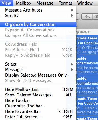
To do so, highlight the thread you want to ungroup, then in the menu bar select “View” and uncheck the option that says “Organise by Conversation”
Now you will see each email as a single item in your inbox again, and new and unread emails will go back to having that little blue dot to the left. If you want to continue to see threads from specific contacts in an ungrouped way, you can just ad a rule (in the rules tab in mail preferences pane) to highlight email from them with a unique background colour.
Again, as I said, this isn’t global, its thread by thread. So if you REALLY hate this feature, a quick way to start making it go away is to select all messages in your inbox simulataneously (Highlight one, then click command and A) and then uncheck “Organise By Conversation”.
If you are using Mac Mail as an RSS reader, this method also works to ungroup new posts on sites you are following.
If you have any other idea’s on how to work around this annoyance, please reply in the comments.

