Continuing on from the last few post’s about how the layout of this site appears in Internet Explorer, as opposed to every other browser, both obscure and popular, David from Digital Raindrops suggested I run the sites code through the W3C Validator to see if there are any errors.
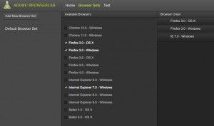
 And sure enough, I had simply forgotten to close a Center tag on an image, which in true IE fashioned, spilled over and ruined the entire site layout, where every other browser was able to deal with it. In the end it was my fault, but I did learn some interesting stuff along the way. Adobe have a feature online now called “Cs Live Services”. As yet, I haven’t had time to explore them completely. What I did find is that Adobe have their own equivalent to Browser Shots, called Adobe Browser Lab.

It is free until April 2012, after which time I expect it will be quiet expensive, and part of a much broader package of software, as Adobe seems to me to be wanting to move us all to using their products online instead of locally on our computers, in an effort to thwart piracy of their programs. Like most Adobe stuff, it looks great!
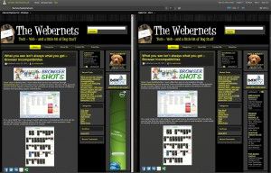
 As you can see, it has considerably less choices than Browser Shots, but it has more than 90% of the world’s computer users covered, which also makes it faster. The drawback for me is that the default size setting for the results is 100%, meaning its a one for view, it shows your site EXACTLY, size and all. In the options, you can reduce the size to only 75%. If you want to view two browser views side by side in a 2-up configurations you had better have a BIG screen.
 A very useful tool, and my suggestion is to use and enjoy it while you can!
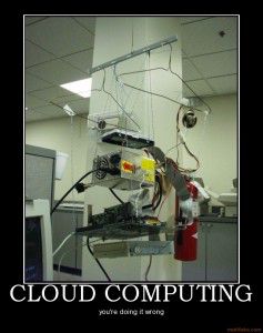
 I saw this picture today, and not only did I think it was pretty funny, I thought about how much I think “The Cloud” is a dumb idea. Its considerably slower when using apps (Have you tried Photoshop Express Online? What about Premiere Express Online?), and if you are storing files “In The Cloud”, what happens if the servers crash, or the company disappears before you can get them back (Happened to me and thousands of others when Bubbleshare and Video Egg went away). You might say, “Well you have to keep a local backup copy!” – Doesn’t that defeat the purpose of “The Cloud”?

